Solving the New Bates Homepage
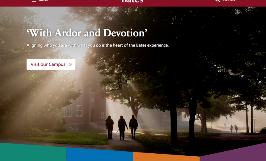
In our latest homepage redesign, Barry Costa and I came up with a design element which we felt was effective and innovative. Our plan was to have a large hero image at the top of the page, which would be shaped into an screen-wide arrow subtly pointing down the page. The arrow would overlap the four columns below, each of which would have a different background color and ghosted background image. Each of the four columns also needed to contain a block of text, a heading, a button, etc.
Also, the arrow shape would always be just visible at the bottom of the screen regardless of the screen size. So while the main part of the image would take up most of the screen for maximum emotional impact, the arrow-shaped bottom of the image would immediately be visible leading the viewer to the next element down.
Lastly, the main photograph, as well as the photos and content in each of the four columns would need to be editable by regular WordPress users.
Problems
My first thought in executing this design was to create an svg shape for the top photo with angled bottom and use a photograph as the background-image for the svg. However, background-images for svg turned out to be a bit wonky and would not do what we wanted after multiple attempts. I could kind of get the image to be cut into the desired shape, however, the angle needed to remain consistent, regardless of how wide the screen was; svg shapes wanted to remain the same proportion, causing the angles to get quite steep when the screen got smaller. My next thought was to give clip-path a try, but the caniuse entry for that property is currently a wall of red (no-support), so that idea was dismissed as well. Another problem that was coming up was that even if I could get the image cut into the desired arrow shape at the bottom, there wasn’t a formula to use to figure out the height of the “cut away” triangles, and there was no way to figure out how far to overlap the columns at the bottom. Also, the arrow point needed to be at precisely the intersection of column 3 and 4 or else the design was going to fail.
What Worked
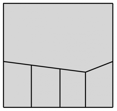
All these factors proved to be a sticky problem, but after applying some good old art-school problem-solving, a solution became apparent: instead of shaping the image into an arrow, we’d shape the four columns into a inverse arrow shape and then overlap the image with the columns.
We can solve this using skewY(), but the rise of the left three columns needs to equal the rise of the rightmost column. With help from SCSS, we can do this:
$angle: 12deg;
$thirdOfAngle: $angle / 3;

.cta1.skewed,.cta2.skewed,.cta3.skewed {
   transform: skewY($thirdOfAngle);

   * {
      transform: skewY(-$thirdOfAngle);
   }
}

.cta4.skewed {
   transform: skewY(-$angle);

   * {
      transform: skewY($angle);
   }
}
In that bit of code, we set the main angle from which everything else is figured. The three left columns are skewed at one-third the angle of the skew for the rightmost column. Also, we unskew everything inside by applying the inverse angle.
This gives us a nice predictable angle. However, now the four columns are in a zig-zag shape, with the left-top of each column 30 or 40 pixels above it’s right-top.
We can solve this by changing the axis point from which the transform is applied. By applying `transform-origin` to the four columns as so:
column 1: transform-origin: 300% 0;
column 2: transform-origin: 200% 0;
column 3: transform-origin: 100% 0;
column 4: transform-origin: 0 0;
We align the transform axis point (origin) into a single point, giving the impression that the tops of the left three columns come down in a smooth angle and then smoothly turn back up for the fourth, in other words, an arrow shape. The skewed shape distorts up which covers the large image and gives us the desired arrow effect.
Of course now the bottom of each column is also skewed, but by simply hiding the bottom of the columns, we solve that.
As noted above, the inner content of the element is now skewed, and can be un-skewed by applying an inverse angle to it. However, this didn’t quite produce a perfect enough result for us. In our case, we created a second set of columns which actually overlay the first set. The first set of columns creates the skew shape, the background color, and the background image, while the second set of columns contains the text content. Then obviously these 2 sets of columns need to be kept coordinated with respect to heights and widths, but that’s easy enough to do using classes appropriately.
At small-screen widths, the 4 columns needed to each be full width. To maintain something of the flavor of the full-width page design, we kept the skewed shapes of the colored blocks, but used them a bit differently, so in this case they feel a bit like they are “dancing” down the page, alternating their slant direction between left and right. You can see that effect in the codePen example above.
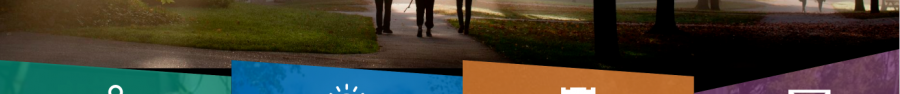
Backgrounds/Colors
Each of the four columns needed to have an image in the background with a color tone. The content, including the imagery, needed to be switchable by end-users. By using WordPress’ featured image as the background, we get easily changeable images easily enough. By adding to each column an absolutely-positioned pseudo-element which overlays the entire column with a unique background color and is set to less-than-full opacity we get the color overlay. The ::after element inherits the transform:skewY() of it’s parent, which is a nice bonus for keeping things simple. Another bonus of using this method gives us an effect of fading in the overlay image as the user scrolls down. We start the ::after pseudo at full opacity, which looks like a solid block of color. Animating the opacity of the ::after element to .8 or so gives the impression that the ghosted image is fading in, when in fact the reverse is technically happening.
Lastly
Aligning the four columns was a perfect use-case for flexbox, and indeed, once I remembered to use the still-necessary -webkit-display: flex vendor prefex, everything worked very well. Making the image nearly the height of the screen (but not quite) was also easily solved with the vh (viewport height) unit.
To solve these problems, we used a whole bunch of newish css solutions (along with some ingenuity). This is a design solution that couldn’t have happened just a year or two ago for that reason, and we’re really happy with out it came out. What do you think? For posterity, here’s the final version of the homepage as described herein: