The Ladd Library Building and Its History
 Times change. The Sept. 6, 1973, issue of The Bates Student featured a story about Bates’ new library, plus a review of Lewiston hangouts and bars. Thirty-two years later, many of those joints are long gone (the building that once housed the notorious Holly blew up in 2004).
But unlike places like Pete’s Lunch and Trader Joe’s, the modernist Bates library has proven “fluid in its concept” and able “to adapt to the unforeseeable needs of the future” two hopes articulated by then-librarian Iva Foster ’30 back in ’73.
For example, says Librarian Gene Wiemers, the building’s flexible design ensured a smooth recent transformation of the library’s reference and research functions to incorporate three “unforeseeable needs” — audio, video and computer-based resources.
Named for benefactors George and Helen Ladd in 1979, the library was a major design challenge for its architects, and its “unabashedly modernist” appearance — Wiemers’ words — has over the years prompted many quips, comments and explanations.
Four factors influenced its look:
1. By 1967, President Reynolds acknowledged that the increasingly cramped library space in Coram had put Bates’ academic status at risk. Three librarians invited to evaluate Coram (and the 1947 “fishbowl” addition in back) said the need was so great that only a new facility would solve the problem. In 1969, a committee chaired by Professor of History Ernest Muller developed a program for a new library. In classic Bates fashion, Reynolds demanded that Muller’s team “concentrate on function,” words he used in his 1972-73 President’s Report. The committee’s building program would, among other things, require great use of the main floor. A single front entrance had to lead to a diversity of library resources (main desk, reference, periodicals, night reading area).
2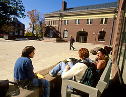 . Around the same time, the architectural firm Sasaki, Dawson & DeMay (forerunner of Sasaki Associates, developer of Bates’ current campus master plan) had articulated a campus plan urging placement of the new library at the heart of the campus, reflecting academic primacy and ensuring easy access to and from dorms and classrooms. Yet the worry was that a new building, near Coram, Carnegie, Roger Bill, and Chase, might fit as well as Dorothy’s house in Munchkinland.
3. The library committee’s plan required a building of 100,000 square feet, six times the size of Coram. “In conventional form such a structure could easily dwarf everything else on the college grounds,” Reynolds said. Specifically, Reynolds and others worried that new structure would visually overwhelm Coram, Bates’ “little gem,” as it was called by The Architects Collaborative, the Boston firm hired as architect. Reynolds “enjoined” TAC “to consider the natural integrity of the campus” and to maintain the “pleasing harmony” of its buildings.
4. The choice of The Architects Collaborative, says art critic and architectural author Phil Isaacson ’47, L.H.D. ’97, “was a really severe break with tradition” for Bates, where ersatz-Georgian architecture dominated under President Phillips. Founded in 1945, TAC was the “aristocrat of American modernism,” Isaacson says. Yet it was the right firm for a tricky project: The Boston Globe once noted that TAC “believed in the collaborative ideal, and was always more interested in solving problems than creating images.”)
The architects, led by Sally Harkness, a founding TAC partner, would address all the issues.
Responding to the requirement of a single front entrance, the need for a large volume of space on the first floor and concerns over the building’s potential bulk, Harkness and TAC discarded the idea of incorporating Coram into any design. Instead, TAC suggested a terrace between Coram and the new building. Beneath the terrace, 30,000 square feet of floor space, including basement space under Coram, would reduce visible, above-ground bulk and “allow [the library] to spring in graceful lines from the terrace” toward Alumni Gymnasium, said Reynolds. The terrace, one story above campus walkways and nearby building entrances, would create new sight lines toward Hedge, Carnegie, Dana Chemistry and other buildings.
TAC associate-in-charge Jim Burlage developed the idea of the underpass and, below, an arcade. “The unique idea of students going through and under the building as the very center of campus activity was persuasive,” Reynolds noted.
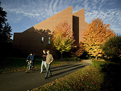
 TAC would report that “our yearning for spatial interest led to designing the pitched roof, giving a feeling of changes in height and space.” The pitched roof ensured that the front of the building remained in scale with Coram, while the large, glassy rear facade is compatible with Alumni Gym, the Gray Athletic Building and Chase.
Other challenges arose. An underground stream had to be contained and the College had to ask the city to give up the portion of Bardwell Street that ran through the site. Trustees fretted over the library’s physical relation to the athletic buildings (was it too tall?). During construction, the building was criticized as being a “parking garage” or a “city structure,” epithets used in The Bates Student..
Yet, as Reynolds noted, “the building’s functional perfection carried the day.” The Maine Arts and Humanities Commission would cite the building’s bold design and commend Bates for departing from its “conventional” past. A glowing review in Architectural Record followed in 1974. Two years later, Harkness’ design was recognized by the American Institute of Architects / American Library Association, a major honor.
More than three decades later, the library, says Isaacson, is still a “helluva building.” Various interior renovations in recent years, Wiemers says, “proof that a 1970s building can remain vital and contemporary, yet true to its origins.”
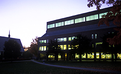
Particularly at night, Isaacson says, the building offers a dramatic sight when viewed from the athletic buildings. The “high, spire-like form” seen as one enters from Campus Avenue is “very dramatic, very inspirational.” The interior “speaks of the enthusiasm of American modernism,” he adds. “You feel that impulse, that push, when you enter. Inside, it’s a triumph.”
Yet though the “coy” entrance off the plaza adds drama to the height within, it is the building’s major “aesthetic shortcoming,” says Isaacson. Lacking a grand entrance and having all approaches by stair or inclined walkway has proven to be “awkward.” Quips Wiemers: “We still wish people could find the front door.”
The terrace, too, though it solves one problem creates “an equivocal space” that seems “suspended above an otherwise flat campus.” And while functional, the terrace, underpass and arcade reflect something of a “Boston aesthetic.”
Though in September 1973 some library work still remained, such as finishing the interior and completing the ground floor, The Student noted that campus quips had given way to anticipation of a better library. “Yes,” the story concluded. “We are ready.”