Columns
Using the Columns Block
Columns are useful for organizing content in a clear and visually appealing manner. This versatile block can accommodate regular text content as well as many other types of blocks such as tiles, sub-columns, images, purloined content, highlight boxes, lists, and Bates profiles. Columns are also highly customizable, allowing a user to choose the number of columns and the width of each column.
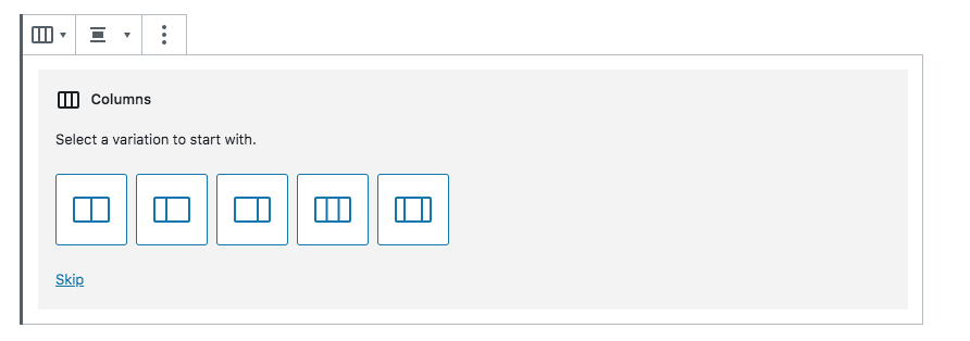
First, type /columns and select the “Columns” block.

You will now be prompted to select a columns template. Hitting the skip button will let you start with two columns and customize from there.
For this example I will use two equally-sized columns. After choosing the first variation to start with, my cursor is automatically set on the left column. Clicking the plus sign allows me to choose a type of content to put within the left column.
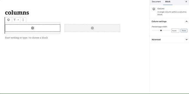
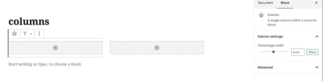
The options on the right sidebar also let me adjust the width of the left column while the right column changes size accordingly.
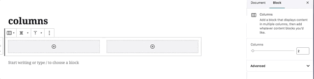
Clicking the empty space between both columns, however, will allow me to use a slider function on the right sidebar to choose how many columns I want. Even though I started with two, I can select more and end up with six columns total.
Examples of Columns in Use
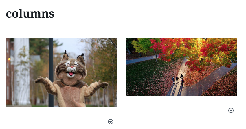
Example of images in columns (block editor and front-end view):

Example of text in columns (block editor and front-end view):


Example of multi-media columns (block editor and front-end view):