Three Big Heads: Inside Bernard Langlais’ Sketchbook
Much of my everyday work as the Collections Management Intern at the Bates Museum of Art consists of cataloging pieces received by the Museum into our EmbARK database. In 2013, the museum was gifted a number of works by Colby College and the Kohler Foundation. Included in this donation was a large collection of Bernard Langlais’ works on paper. Langlais, born in 1921, was a native Maine visual artist whose work is incredibly extensive and diverse. Even though he is well known for his large animal sculptures, working with his much smaller works on paper has shown me his incredible range, as he experimented with multiple mediums such as oil paint, crayon, pencil, watercolor etc. Langlais also did not fixate on one figure or content. In fact, he made multiple depictions of landscapes, nudes, and abstract still lives (just to name a few).
When cataloging these works, it is important to be meticulous and take one’s time. In the database I record the date, title, dimensions, medium, and support. I also write a description of the piece using specific depictive vocabulary. One of the most important aspects of this task is to fill out a conservation report, which is an updated description of the piece’s condition. This is where I must look intensely for any damages to the piece such as discoloration, foxing, creasing of the paper, paint cracking, smudges, or fingerprints. A valuable aspect of this task to me personally is my new knowledge of the vocabulary used in the real art world that I will be able to use and understand when I begin my career after college.
I came into this internship with the certainty that I want to have a career in the art world, whether it be an art curator or an art dealer. This internship has given me the opportunity to immerse myself in museum life. Every day, I have hands-on experience with curators and exquisite pieces of art. That is why I appreciate my cataloging work so much. While the task may seem tedious, when cataloging I am able to really see the work up close and personal. I have learned so much about different mediums and how they work on paper and how to analyze the condition of a piece. One aspect of cataloging dozens of pieces from the same artist that I find fascinating is that I am able to put myself into Bernard Langlais’ mind. I am flipping through his sketchbook, so I can track what topics and mediums he becomes interested in and when the fascination begins and ends for him. After working exclusively with his art, I am able to recognize his tendencies and patterns with forms, colors, and content.
Of the numerous works on paper by Bernard Langlais that I have worked with since January, there were many that caught my attention. However, in this blog post I decided to focus on three head portraits made from oil paint and crayon on orange construction paper. Officially, these paintings are untitled, but I call them “the big heads” and chose them because they are a great example of Langlais’ true range and talent as an artist in depicting such different emotions and figures using the same support, medium, and color palette.
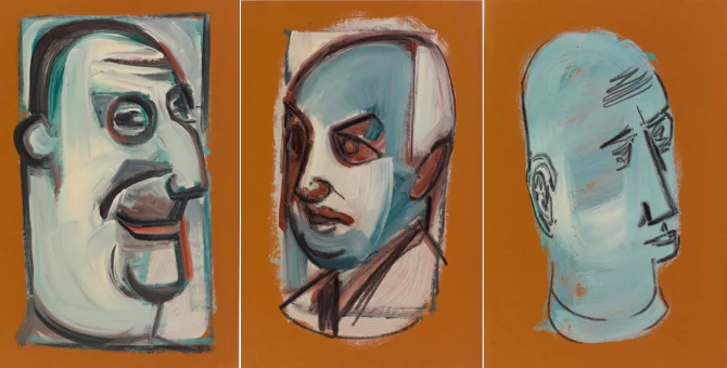
These three “big heads” are so similar, yet so different. They can be presented together, yet can stand on their own. All of them are painted on this orange construction paper which must have been a fleeting fad for Langlais as there are only a handful of these paintings on orange construction paper before he switches back to regular sketch paper. He uses the same color palette of light blue, white, and a brick red/orange oil paint and black crayon outlines. The same ingredients are used for all three heads, but each one has distinct features and depicts different emotions.
The head on the left (2013.19.64) is simpler than the other heads, but despite the fact that this head was made only with two colors of paint and a black crayon, I believe it is the most expressive face. The prominent worry lines on his forehead, furrowed brow, crumpled eyes, and stiff bottom lip depict that the figure is worried, concerned, confused, or contemplating something very important.
The center head (2013.19.62) projects the angriest emotion. This is due to the fact that the figure’s eyebrow is arched very sharply, his lips are pursed, and Langlais uses the most burnt orange paint in this image, contributing to a more fiery mood. In this portrait, Langlais focused on the eyes. The very large eyes sit almost diagonally, which emphasizes the arch of the brow even more. The combination of the intense eyes and brows mixed with the brick red paint creates a sense of intensity burning from within this figure. This image also continues past the neck down to the chest unlike the other two portraits and this figure seems to be wearing a collared shirt.
The head on the right (2013.19.63) has the most accentuated and distorted features. His eyes stand out to me the most because they are so large and perfectly circular. There is no presence of an eye socket, so this feature is very two dimensional. The shape of the figure’s head is almost completely rectangular, leaving little to no distinction between the head and neck. The little smirk on the subject’s face delights me. Langlais makes the figure’s lips curl at the ends creating
smile lines and even paints the lips with that same red brick color bringing more warmth into his smile.
I appreciate that Langlais focused on different features for each head. In the left painting, it is clear that he spent much more attention to detail on the ear and eyes. However, in the right piece he paid almost no attention to the ear and focused more on the chin/mouth area. Each head has incredibly different features and depicts such different emotions despite such similarities in subject matter, support, and color scheme. I find the use of unconventional color and facial features so fascinating because the character’s emotions are so human. Such clear moods and emotions are depicted through minimal color and naturalistic detail.
Clara Kennedy
Class of 2025